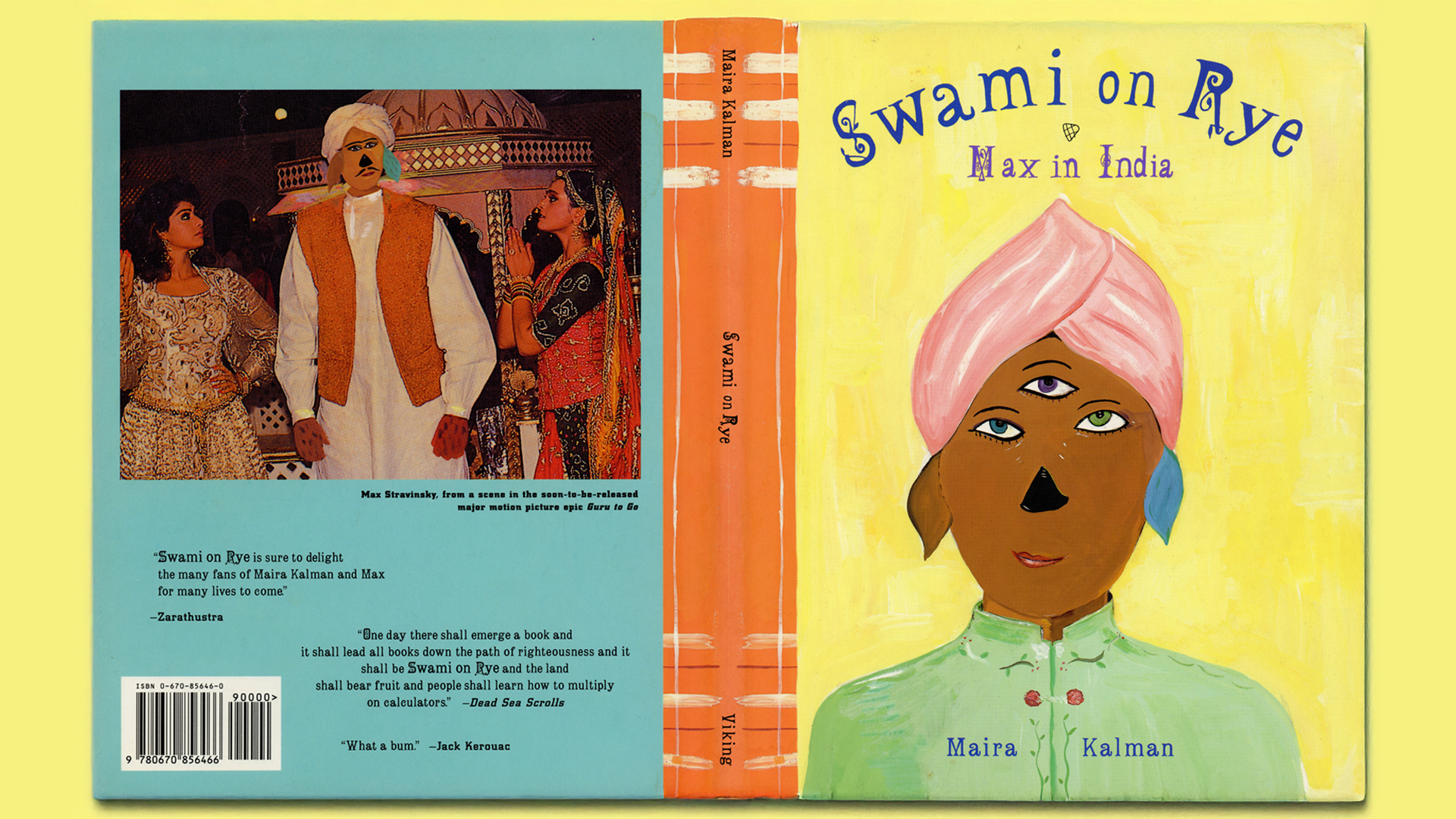
My first job after graduating from Parsons School of Design, was at Number 17, where one of my earliest projects was designing Swami on Rye, a children’s book by the brilliant Maira Kalman.
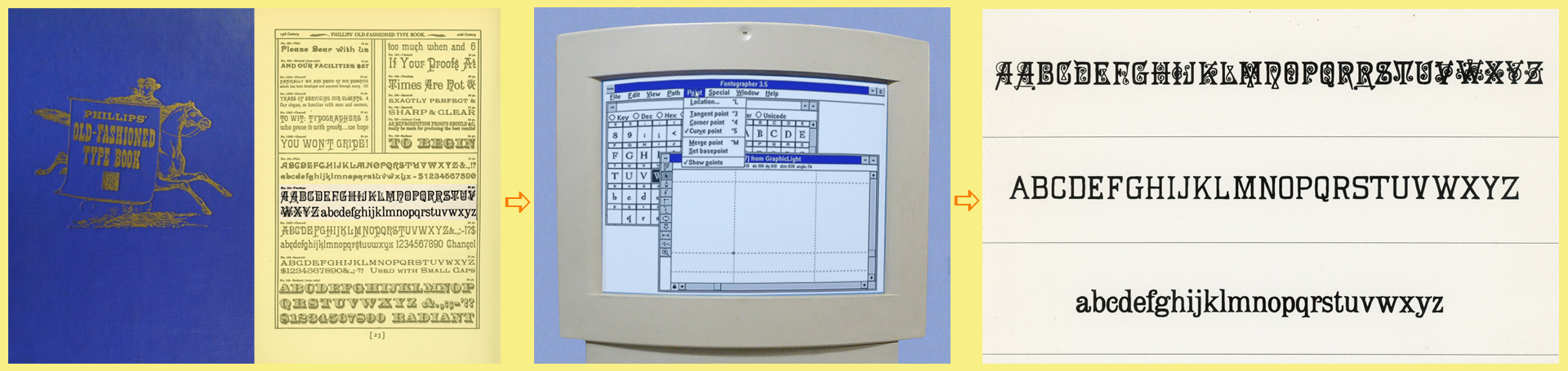
I searched through early 20th-century type books for a typeface with the right look and feel for Maira’s story. Since a digital version of the selected font didn’t exist, I redrew it in Adobe Illustrator—no small task in that early digital type era. From there, I programmed the full upper- and lowercase font in Fontographer and also developed a non-decorative version of the uppercase letters.
Maira hand-painted the book’s title using my reinterpreted font as a guide, turning the cover into a game of typographic telephone! My font also appeared on the dust jacket but was replaced inside when Maira’s husband, Tibor Kalman, suggested swapping it for an existing digital typeface—an early lesson in choosing what works best over what took the most effort. For the book’s layout, I worked under my boss, Emily Oberman (now a Pentagram partner), to create a design as playful as Maira’s storytelling, making the process a deep dive into color, composition, and pacing.


PROJECT COLLABORATORS
Emily Oberman
Maira Kalman
Tibor Kalman